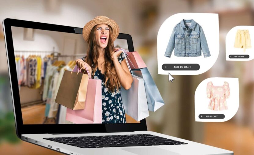
The visual side of an online fashion store is the closest thing customers get to touching the product.
Every fabric, stitch, color shade, and silhouette is evaluated through a screen, so presentation becomes the main deciding factor in whether someone feels confident enough to add an item to their cart.
The concrete answer right from the beginning is simple: your store needs clean and honest product images, consistent lighting, a layout that feels calm, and storytelling visuals that show outfits in real use.
When your store feels visually trustworthy, customers browse longer, interact more, and develop the confidence that leads to conversions.
1. Build a Clear and Consistent Visual Identity
Fashion stores with inconsistent visuals often feel chaotic even when the product lineup is strong. A stable visual identity makes your store feel intentional. This includes the colors you use for backgrounds, the typography for product descriptions, and the way your images are cropped and aligned.
A store that uses warm neutrals for backgrounds and soft shadows in all images will always feel calmer than one that randomly switches between white, wooden, marble, or textured surfaces. Customers appreciate visual predictability because it lowers the effort required to browse.
Visual Identity Breakdown
| Element | Details to Standardize | Impact |
| Background color | White, beige, soft gray | Makes items feel cohesive |
| Lighting style | Soft studio, natural light | Creates familiar expectations |
| Image ratios | 4:5 or square | Prevents jumpy page layout |
| Typography | One font family | Makes scanning easier |
When all visual elements work together, your store begins to feel like a brand instead of a random catalog.
2. Use High-Resolution Images Without Slowing the Site
Fashion shoppers zoom in. They look at stitching, texture, buttons, draping, and finish. A blurry or compressed photo instantly creates doubt. High-resolution images make clothes feel real and honest. However, oversized files slow the site down.
The solution is simple: export images in WebP or high-quality JPEG with careful compression. Your goal is the sweet spot where textures remain sharp but pages still load smoothly. Most stores see excellent results with images in the 250–400 KB range with built-in zoom functionality.
3. Keep Backgrounds Clean and Neutral
A good background disappears. Customers should notice the clothing, not the scene behind it. Clean neutrals like white, sand, or soft gray almost always work best. They also improve color accuracy because light reflects more evenly.
One of the most common mistakes is using multiple backgrounds across a single category: marble for tops, beige for jackets, textured wood for shoes. This disrupts flow and gives the impression that items were photographed at different times, or worse, sourced from different places.
The calmer the visual environment, the more professional your store appears.
4. Add Lifestyle Images to Show Real Context
Studio shots cover the essentials, but lifestyle photos bring emotion and realism. They answer questions like:
How does a dress move while walking?
How bright does the color look outdoors?
Does the fabric reflect light or absorb it?
Lifestyle photos also help establish brand personality. A streetwear shop might shoot on urban rooftops or alleys, while a minimalistic brand might use soft indoor spaces with subtle textures. These details create a sense of world-building around the clothing.
5. Organize Product Pages for Smooth, Low-Stress Scrolling

Visual chaos ruins the shopping experience. A strong product page feels calm. Everything is spaced evenly, arranged logically, and easy to digest.
A reliable structure looks like this:
- Main product image
- Thumbnail gallery
- Title, price, and sizes
- Short and clear description
- Fit details + model measurements
- Materials and care instructions
- Extra lifestyle images
- Reviews
Spacing matters as much as the content. Your goal is to avoid the “cluttered online shop” feeling that makes buyers want to close the tab.
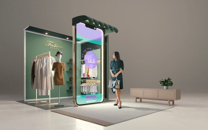
6. Add Small Motion Effects That Bring Clothing to Life
Fashion is physical. Movement reveals shape. Even small touches like a hover-to-reveal back view or a slow fade transition can make browsing feel premium.
Short video clips are also highly effective. A model walking naturally in a dress or adjusting a jacket shows far more than a static photo. Keep videos short and subtle. They should complement the photo set, not overwhelm it.
7. Use Branded Cards and Graphic Elements to Guide Attention
Every online fashion store eventually needs small visual markers: “New,” “Limited,” “Back in stock,” “Trending,” or “Editor’s pick.” When done poorly, they look like stickers slapped on top of images. When done well, they become part of the brand’s visual language.
This is where a clean, unified card style helps. Many store owners create simple templates so that every tag follows the same colors, shapes, and typography. In practice, people often build those elements using a lightweight card generator, like the tools found at Adobe Express, which let you create neat product tags that match your brand without heavy design work.
Dropping small, consistent cards into your product grid gives shoppers subtle direction while keeping the store visually stable.
Using these visual cues correctly increases product visibility without interrupting the browsing experience.
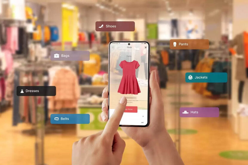
8. Display Colors and Sizes With Clear Visual Structure
Nothing frustrates shoppers more than vague sizing details or color labels that don’t match reality. Visual clarity reduces returns and increases trust.
A great solution is to combine color swatches with interactive preview photos. Customers should be able to click a swatch and instantly see the corresponding image.
Sizing should also be well-explained. A simple, visually clean sizing table helps tremendously:
Sizing Guide Example
|
Size |
Chest |
Waist |
Hips |
Notes |
| S | 86–90 cm | 70–74 cm | 88–92 cm | Slim fit |
| M | 90–96 cm | 74–78 cm | 92–98 cm | Regular fit |
| L | 96–102 cm | 78–84 cm | 98–104 cm | Slightly relaxed |
| XL | 102–108 cm | 84–90 cm | 104–110 cm | Best for broader builds |
Clarity like this makes customers feel more confident in selecting the right variant.
9. Style Complete Outfits Instead of Isolated Items
Customers do not think in isolated pieces. They think in outfits. Showing complementary items together helps shoppers see how a single product fits into a full look.
For example:
A blazer styled with tailored pants, loafers, and a thin leather belt.
A knit sweater is shown with relaxed denim and minimal sneakers.
A dress paired with a small handbag, soft curls, and simple jewelry.
These outfit-level visuals increase the chances of cross-selling because shoppers imagine more possibilities. They also strengthen your brand identity by presenting a consistent style direction.
10. Integrate Social Proof and UGC Into the Visual Flow
User-generated content is the visual honesty customers crave. Seeing real people wearing your clothes helps them evaluate fit, drape, and lifestyle compatibility. Reviews with photos build trust faster than any marketing image.
Encourage customers to share their photos by giving them a simple upload system, reposting their looks on your social pages, or offering a small loyalty reward.
The goal is to create a living visual ecosystem that grows and evolves alongside your brand.
Final Thoughts
Strong visual presentation in a fashion store is not about complexity or expensive equipment. It’s about intention, consistency, and clarity.
Customers want to see products honestly, understand fit quickly, and feel like the store takes design seriously.
When your visuals give them that stability, your store becomes more than a shopping page. It becomes a place they trust.